
Physical version of Bitcoin and dollar banknotes. Exchange bitcoin for a dollar symbol. Conceptual … [+]
Bitcoin finally closed slightly higher than the previous weekly peak set in 2019 but then backed away Wednesday. That might be a chart breakout signifying new strength — if that level can be re-gained and held.
The other cryptocurrencies tend to trade in similar patterns to one another but each has a distinctive look depending on the time frame involved. Take a look at these price charts to see what I mean.
On the Bitcoin daily price chart, a classic candlestick pattern:
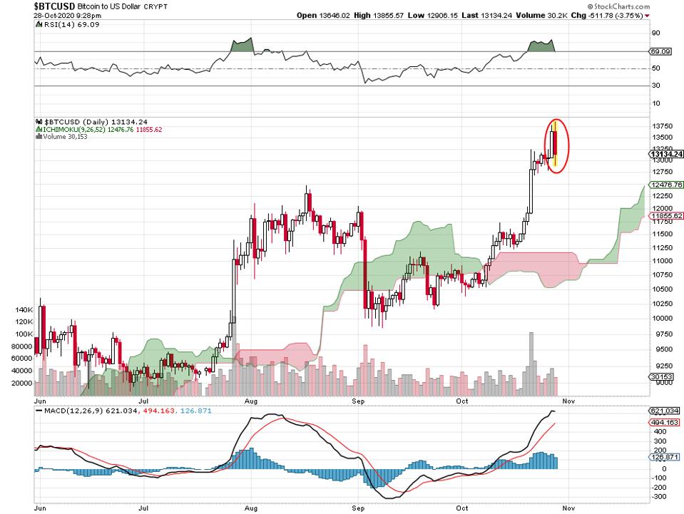
Bitcoin daily price chart, 10 28 20
The bearish engulfing is not good news for investors in the cryptocurrency, as the name implies, as least for the short-term. The high today is higher (barely) than yesterday’s high and then it sold off to lower than yesterday’s close before ending the day just above those lows.
The Bitcoin weekly chart seems to send a similar message:
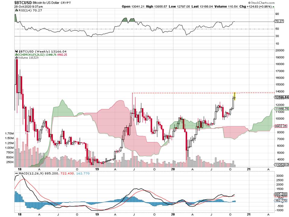
Bitcoin weekly price chart, 10 28 20.
After making it all the way back to the mid-2019 high up around 14000, the price pulled back to the lower end of the weekly range. This happens when investments run into previous zones of major selling: resistance levels. The challenge for Bitcoin investors will be to see a close or 2 above 14000.
The Ethereum daily chart looks a little different than the Bitcoin daily:

Ethereum daily price chart, 10 28 20 (correct)
The crypto is underperforming its sister Bitcoin by failing to make it to a higher high during October. For whatever reason, September’s intense selling from the 480 level is keeping Ethereum from making too much progress. It looks like a nice short-term uptrend, though, from the last month’s low to the present.
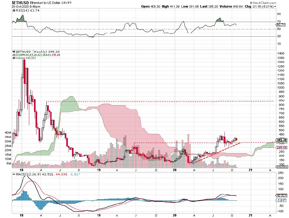
Here’s the Ethereum weekly look:
Ethereum daily price chart, 10 28 20.
This cryptocurrency already took out its own mid-2019 high. That breakout came earlier this summer. From that standpoint, it’s been earlier to move upward than Bitcoin. Note the steady uptrend that’s been in place since the March lows of this year.
Also note that Ethereum is managing to stay above that old 2019 high almost steadily since the breakout. The next level of significant resistance might be the April/May 2018 high where big sellers unloaded last time it was up there.
The XRP daily price chart looks like this:
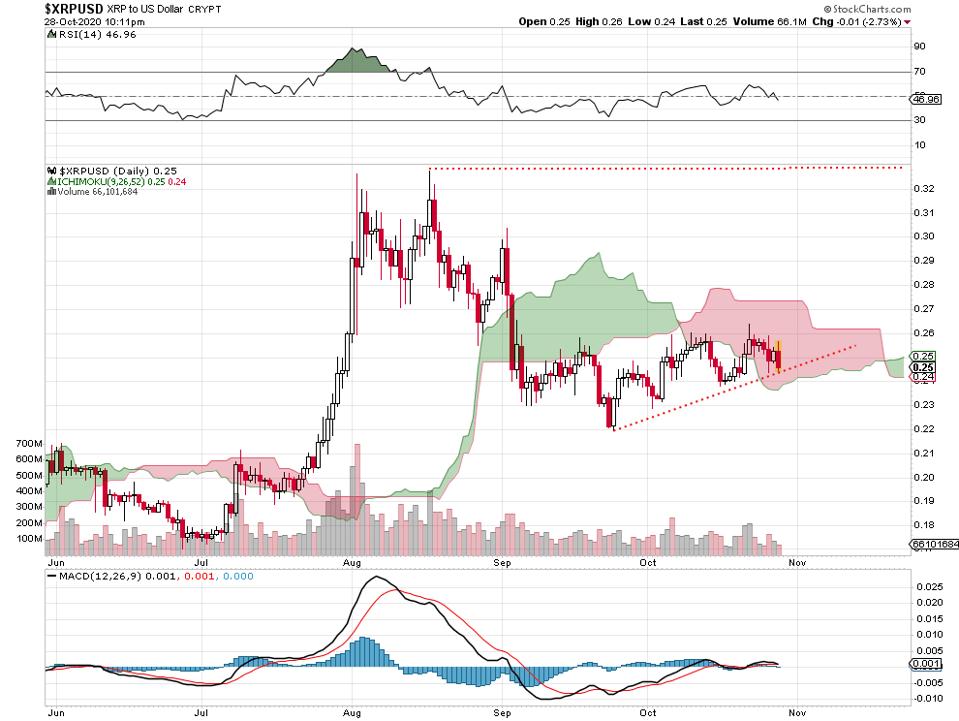
XRP daily price chart, 10 28 20.
That late July rally is a monster for this penny-stock version of the cryptocurrency world. It looks as if my blackjack expert friend in Las Vegas called it. Since the August highs, XRP is not keeping up with the other cryptos. But that’s the beginning of a decent uptrend off of the September low. A close above the 33 resistance might be bullish.
The weekly chart for XRP looks like this:
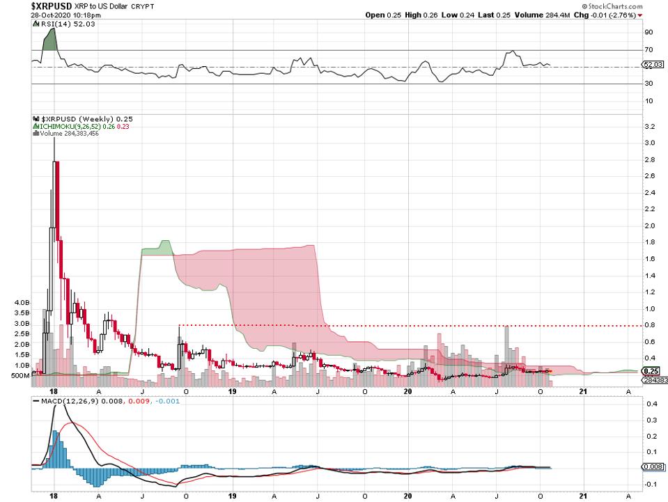
XRP weekly price chart, 10 28 20.
Yes, it is true: XRP sold for above $3 in early 2018. From then and there, it’s not difficult to ascertain the steady fall downward into 2020. This year’s seemingly bullish action is greatly diminished on this chart. It looks like this crypto might find resistance up there near .80 from September, 2018 high where sellers took over again.
None of these are buy recommendations. The idea that these might benefit from selling in other types of investments remains to be seen.
I do not hold positions in these investments. No recommendations are made one way or the other. If you’re an investor, you’d want to look much deeper into each of these situations. You can lose money trading or investing in stocks and other instruments. Always do your own independent research, due diligence and seek professional advice from a licensed investment advisor.